 |
Holiday Inn (or not), Victorville California
|
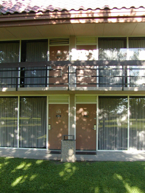
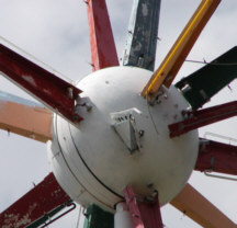
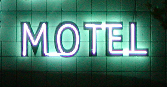
The local Victorville paper online says the Green Tree Inn property was built in 1963 - which checks out neatly between 1959, when there were 100 Holiday Inns in America, and 1964, when there were 500. And the local paper says this property had one long-term owner for 40 years, a guy named Walter Schroeder. This checks out. This place seems to have been lovingly maintained to almost museum quality, time-machine quality, a classic Holiday Inn loping forward glad-hand extended with a full head of hair and glowing skin, lurching up at me from my own childhood, argh! It looks and feels like the original furniture. And you can only get that kind of devotion from a single person who cares, and who likely drove his maintenance staff crazy with unreasonable demands. Until recently, when Mr. Schroeder sold out and retired to the California shore. He left behind a full-service 200-room motel called the Green Tree Inn, now a Best Western. The local Victorville paper also describes the distinctive landmark out by the highway, the sign that many people associated with Victorville's civic identity until it was brought down in 1997, a giant red highway sign. Wait. Red? Red sign? That can't be right.
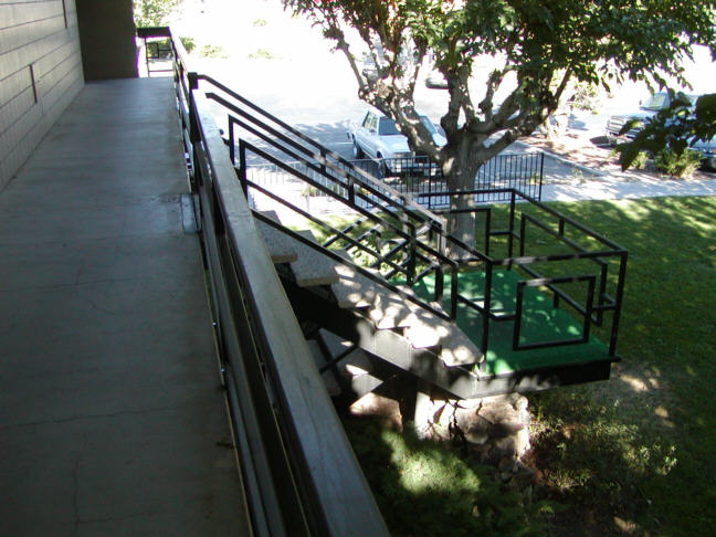
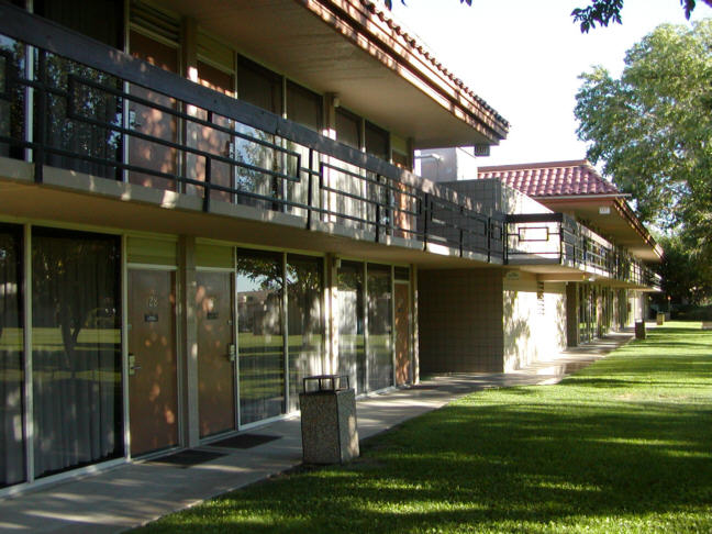
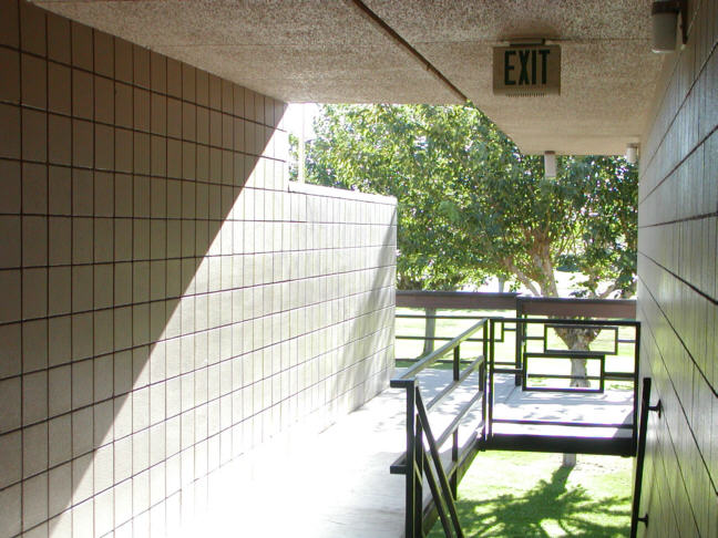
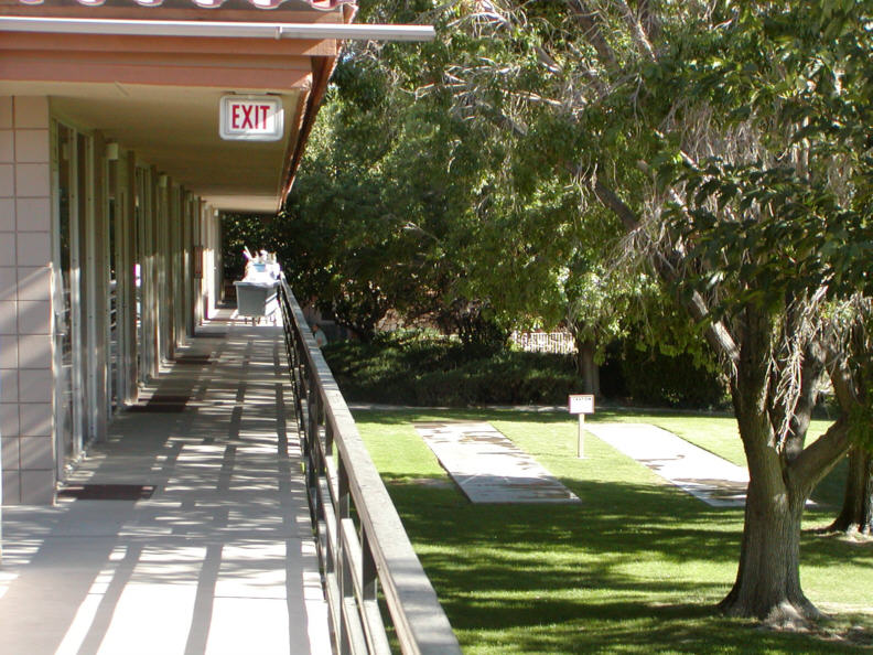
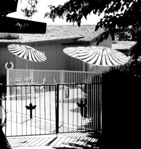
Well, the facts don't bother me. I have the evidence of the layout, the tell-tale squares in the black exterior stair railings and green matting, the height and shape of the door hardware on the aluminum door-frame inside my guest room, those prototypical pool umbrellas, and my stubborn taurine belief. Its holidayinnness is coded into the angled relationships between the office and the rooms, between the site and the highway. Squint and you can sense the swell of the original pristine, dewy meadow against the new white two-lane road as it was in 1963. I know this was a Holiday Inn. It's the cleanest example I've seen since Cortland NY. Because I grew up on the road in the mid-60's, this architecture is basic to my consciousness. I carry the Holiday Inn spatial template around in my heart. Well whatever.
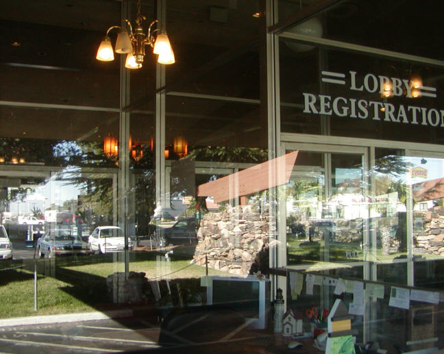
The point is, this place is a surprise, no surprise, and where else can you get up close and personal with an undiscovered chunk of modernist treasure all night for $80? The lobby has its own set of pleasures, the big rocky angled supports, the dramatic tilt in the roofline, all these acres of plate glass - all of this stuff signals an increasingly rare Californian sense of abundance and ease. A great coffee shop. Victorville is not far from Palm Springs in miles or climate, and it turns out that among the remaining well-preserved modernist work still standing in these high desert towns there's a 1957 Paul Williams Bank of America. So it's not such a shock. But I'm shocked by a number of things. Shocked by its splendid physical condition. From the "Special Resource Study Route 66", issued by the National Park Service in 1995: "Motel construction boomed in the late 1950s and early 1960s. For financial reasons motel owners often provide only minimal maintenance and repair and often sell after the tax advantages expire. Buildings often deteriorate until they change ownership and are renovated. Architectural integrity in motel building is thus short-lived. The tax code has encouraged a brisk trade in second, third. and even fourth-hand motels, many of which would otherwise have been abandoned. It has also encouraged flimsy construction. In 1960 the average life of a motel building was nine years."
Also shocked that my well-remembered beloved Holiday Inn spatial experience is so in line with what I've since learned to see as German Modernism from 1925 - 1930. Crisp, boxlike, and quite clear. It had never occurred to me. I never thought of it as having a style, but there it is. Duh. Holiday Inn's original Memphis architect was a guy named Eddie Bluestein, working from Kemmons Wilson's own 1952 field measurements. Bluestein turned the plans around in a few days. This classic Holiday Inn configuration a la Victorville may have developed a few years later, under the standardizing time- and money-pressure of an explosively successful franchise, but I see its aluminum-and-glass right angles as a perfect expression of commercial modernism, workable to an extreme degree. Trim by necessity, like an airplane is trim - and thoroughly in the Modernist tradition in its blindness to context, built anywhere, everywhere, plunked down on the grass with absolutely no regard to the site, almost helicopter-deliverable.
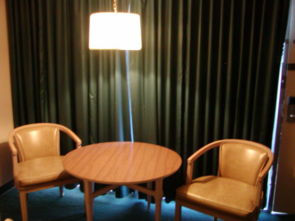
And shocked that this example of commercial modernism is so comfortable and scaled to humans. Its dimensions fit and breathe around me like good old cotton clothes. I know something about social configurations and furniture, and I'm amazed all over again at how this classic room design packs so many sittable surfaces, working surfaces, storage areas, lines-of-sight to the television and outside, and such a balance of public and private distances into such a small, relatively flexible, standardized space. It has deficiencies, sure, but for a 40-year-old act of space planning you could do a lot worse.
All this is a strong reminder that, despite the ridiculously austere and hostile Farnsworth house as a classic prototype, despite International Style often degenerating into a tense aesthetic with no sympathy for human weakness or size, despite all that prevalent mid-Century Mies-knockoff dumb-ass formalism that only looks good in a line-drawing elevation, there's another answer. Proof that you can reconcile this clean tight aesthetic with human dimensions, and make everybody happy. You could draw a line, if you wanted to, from Neutra to Holiday Inn. Naturally it would be a straight line.
|
Copyright 2006 - 2010 Walt Lockley. All rights reserved.
